Submission
Two weeks ago, I handed in my thesis for examination. In Australia, we call this event the ‘submission’, where three heavy, bounded copies of your work are entered into all manner of administrivia before being distributed to two anonymous examiners, and a third if those two disagree.
There’s no defence as such; just a presentation to a panel of academics, usually from your own department, relaying the main achievements and where any concerns (typically the students) are allayed.
The final title was “Reframing Space for Ubiquitous Computing: A Study of a National Park”. In hindsight, I would have subtitled it differently, going for something like ‘The Case of a National Park” to make it sound like there was more of a story inside.
I was satisfied with it in the end, but need more space between then and now before commenting on the work any further. It was a truly fulfilling experience, but an exhausting one, and I plan on taking my time savouring its completion and recovering from it. I’ve applied for a publication scholarship from RMIT to turn some of the research into a more disseminate-able form, and will hopefully spend some of the next three months working on a couple of journal articles. That will distract me from the long wait for my examination results.
After that, I’ll publish excerpts from my thesis here, and offer the full thing for download. I’m inspired by Philipp Vannini’s Ferry Tales, and want to start experimenting with different ways of presenting and communicating ethnography online and in an interactive way.
For now, i’ll be enjoying reading this, this, this and this on various beaches.
A New Abstract
The last 6 months have been a whirlwind of writing, reframing, designing, and presenting as the deadline for my thesis submission approaches. I haven’t posted any of this new work here as it’s been such a dynamic process that I haven’t wanted to document it in public. However, a few weeks ago I was forced to finally update my abstract to reflect what the final incarnation of this research is likely to be. I’ve updated the abstract page, but to save you a click, here it is:
Ubiquitous Computing is a project within human-computer interaction that aims to embed computers into everyday spaces. As computing has moved away from desktop paradigms and is increasingly designed to operate ‘in the world’, the practice of ubiquitous computing has become heavily concerned with issues around space and place; particularly, with how technology fits in the relationship between people, space, and the understandings that bind them. Given the wider range of social and cultural contexts computational devices find themselves in, understanding the existing relationships between humans and their environments has become increasingly important to designers of technology. However, most of this research is centred around urban computing, conducted within cities, or focused on the mobility of urban dwellers. Indeed, little focus has been given to ubiquitous computing for non-urban environments.
This research expands the understanding of the relationship between technology and environmental understanding for ubiquitous computing. Through the case study of a national park, this thesis proposes new ways of thinking about designing technology that plays a role in the production of environmental understanding that moves beyond the typical focus on urban centres and mobility. It does so by drawing upon relational notions of space and understanding from cultural geography; examining how meaning of the world is socially and culturally produced and constructed. Building on this foundation, two multi-sited ethnographic studies with a state government organisation, Parks Victoria, are presented that demonstrate various productions of environmental knowledge in practice.
Based on analysis of these studies, a series of design principles are presented that reframe space and environmental understanding as emergent and seasonal processes. Drawing on these design principles, two design concepts are presented that are envisioned for use within Parks Victoria: Habitat, a location-based platform for tacit knowledge, and Wayfarer, a visualisation and narrative tool for situated understandings. A reflection on these related pieces of research will then serve to highlight new, practical directions for further work in ubiquitous computing in a non-urban context.
Dissecting cities
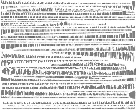
Armelle Caron has started a project dissecting the grids of cities, and laying them out linearly. The above is a picture of every single block in Paris. New York, Istanbul and Berlin have also been dissected. It’s a really interesting way of visualising the complexity of the city and it’s network of streets, walkways and alleys. It’s amazing how many of them look like faces to me.
Thanks to Owen for pointing this out!
Digital territories
If you haven’t seen the news this week, there have been increasingly violent protests in Beijing over a territorial dispute between China and Japan about a set of small islands in the East China Sea. The two countries have a number of complicated historical tensions: the Japanese invaded and occupied China in 1931, and the anniversary of the invasion is in this coming week. I won’t go into detail on that, but you can read more about that piece of history, in the context of the current dispute, in this guardian editorial.
Whilst the dispute over the islands will continue to play out on the political and diplomatic level, what I found interesting were the territorial claims happening in digital space. The picture above was a ‘doodle’ on Chinese search site Baidu. Popluarised by Google, doodles on the American search site have generally been used to mark historically significant events, anniversaries, or tap into some timely global sentiment (as evidenced through the recent olympics).
However, Baidu’s doodle is asserting a territorial claim on real, tangible pieces of land. This isn’t the first time technology has been used as a tool in asserting views of geographical borders – google maps and google earth famously show different borders depending on the language you view them in. Viewing Tibet or Taiwan from a Chinese-language version of these products would tell a different story than viewing the US-English version, for instance.
In addition to the ‘doodle’ though, Baidu have set up a site that allows virtual flags to be placed on the archipelago, where over 2 million people have staked their claim on the land. All borders are, of course, constructed out of political, economic and social interactions; they are constantly shifting and negotiated. However, this is the first example i’ve come across where a country/organisation has essentially been able to crowd-source territory.
Maps and cartographic representations as technologies have been used for centuries to define borders, regions and territories. With this recent dispute, cartography finds itself in a new ‘landscape’ – one that is defined by the same real-time, socially driven technologies that are disrupting so many other industries and disciplines.
I’ve had an iPhone developer account for about two years, and since the start of the year I’ve been doing more and more programming; prototyping ideas and working on a business case for them. It came time to renew the account last week, and so I decided to make a quick, useful app to dip my toe into the app store.
Solvetica is a minimal calculator for iPhone, that features gesture support, a calculation history and – of course – helvetica. 
The app itself is only part of the story of course. I did this to get a feel for what it’s like to bring something to ‘market’ – where it appears that marketing something as ‘good design’ is just as important as actually designing it well. I’ll admit, the app took about 5 hours to make (most of that was making sure the interface was pixel perfect), but the supporting material took four times as long.
It included:
- A logo and icon
- iTunes screenshots
- A marketing website (including a few iterations)
Seeing three things in a list here doesn’t seem like much, but getting these right involved multiple iterations, and I’m still not sure if they’re as effective as they could be.
Given the main purpose of releasing Solvetica was to learn about the app store and “what it takes” to get something released and released properly, I haven’t skimped on the time spent on these activities. I’m about to set up A/B testing on the marketing site to see what I can find. I’m paying close attention to app store rankings and correlating that to sales. I’m even trying a few marketing channels to see what gains it attention and what doesn’t. All of these will be valuable lessons when it comes to doing something more weighty next year.
I’ll be posting findings from these experiments as soon as I find anything interesting. In the meantime – check out Solvetica. It’s actually very nice to use!
Personal Geographies and Constructed Histories
One of the research activities I conducted with Parks Victoria involved a mobile diary study. There are a couple of great introductions to the topic if you’re interested, but broadly; diary studies are a way of having participants reveal their daily practices through guided self-reporting. Mobile diary studies do this through the use of a mobile phone. The benefits of this: users typically already have a device, and these can be used to prompt participants for insights on their activites, real-time photos, etc.
In the context of my research, I opted to use a mobile diary study in order to gain an understanding of the practices of Park Rangers in relation to the places they manage. A mobile diary study seemed great for this as it allowed people to make entries whilst in the park itself – using the places and locations they work in and travel through as points of reflection. On top of this, the period during which the study ran was in the aftermath of a severe flood, and the recovery effort was worth investigating.
This post is about how the activity revealed more about their practice than I had released it would. What it highlighted was the deep connections people had to areas of the park – and how different these connections were for each individual participant. It is these connections that revealed a personal geography of the park; a type of mental map of the park that was emotive and subjective rather than abstract and representational.
Study Design
The dairy study was run using Evernote on a set of iPhone 3GS’s. Six rangers at Wilson’s Promontory were asked to participate, and their roles were carefully chosen in relation to their level of experience in the park, their typical duties, and the length of time they had spent in the park. I met with each participant in person to talk them through the use of the application, and to set up the expectations for the study. I also left a cheat sheet with them, detailing some “entry inspirations” that doubled as guidance on the types of entries I was looking for.
Download the cheat sheet I gave participants.
As you’d expect, we did some practice entries in our kick-off session, and I was careful to voice the usual reassuarances: there’s no right or wrong; even what you think is boring is interesting to me, etc.
Using Evernote was beneficial in a lot of ways. Originally I had planned on making my own diary study tool, and whilst Reuben and I managed to produce a working prototype, we abondoned it due to the difficulty in synching the data. Evernote’s built in web service was fantastic during the study as I was able to monitor entries in real-time. Each of the phones had a data allowance, and Evernote was set to automatically upload new entries as they were made. At the end of each day I would check what had been entered by each participant, and this was a great way of monitoring progress.
Feedback and encouragement was typically sent every 1 or 2 days via SMS to the study phone, and I have no doubt that this had a positive effect on the outcome of the study. In total, there were over 90 geo-tagged and time-stamped entries comprising of audio, video and photography – a very rich account of what had happened during and around the flood recovery.
Revealing personal geographies
Rather than thinking of the Park as a single geographical space, it can be thought of as a combination of different productions of space, including individuals unique interpretations of it. This implies that what is defined as a “park” is a multilayered entity that is constructed out of a number of different perspectives. This ‘relational’ notion of a space is grounded in cultural geography, but has recently begun to appear in human-computer interaction and design generally.
By asking people to carry the phone with them, it revealed the importance people placed on certain locations in the park; it helped reveal a participant’s subjective experience of the park. Each participant’s collection of diary entries provided one slice out of many that contribute to the Park’s overall meaningfulness. This ‘slice’ is what I’m defining as a personal geography here.
It showed/created a narrative for each participant as they moved through the flood recovery – their personal geography showed how certain areas in the park loomed large for them. By recording their movements and thoughts, it gave insight into their park, whilst also providing an enduring record of the historical event of the flood.
Evernote’s API allowed me to plot out their movements throughout the study period, but also to augment those movements with recorded media. These narratives formed a type of qualitative map – a “personal geography” that represents the relationship between that person and the park, during a particularly severe natural event. You can see some very basic results from this is older blog posts.
Forming Histories
The goal of the study was to gain an insight into the daily practices of park rangers. As such, participants were asked to talk about details of their days they went about it. Unsurprisingly then, most entries were topical and timely to the day they were recorded; they were about difficulties encountered, conversations had or in some cases, were even notes to the participant themself for a later time. However, a number of entries were reflective and interpretive in nature.
What this highlighted was that certain staff desired a platform to share an interpretation of places filtered through their experience. They were reflecting on locations in-situ, and when asked to talk about those places, they began interpreting them in relation to current and past events and their own experiences working within them – particularly reflecting on what had changed over time. They were recording a history of that place that was tinged with their own lived experiences of it: the diary study (end evernote) were their platform, and the place itself was a tool for reflection.
Most of these reflective entries were oral in nature, however they were supported by photos in some cases. What the diary study provided participants with was a platform for constructing oral histories. They were providing new knowledge about and insights into the past through an individual biographical account, and these accounts represented an interplay between the past and present, the individual and the social. Boiled down to its essence, what rangers were doing was performing an act of memory.
So, inadvertantly, by giving rangers a tool to report about their day, what actually occured was something deeper: it acted as a prototype of a system that allowed them to construct histories.
Research methods as systems prototyping
This surprising use was evident all through my research, not just with the diary study. More on that another time – I wanted to write this here to highlight (first) that Evernote is a fantastic tool for conducting mobile diary studies, and (second) that clever incorporation of technology in the design of your research (as very different to interface design!), can provide you insights and inspirations for future designs of actual systems.
Needy Technology
There’s very little emotional intelligence designed into technology. Email software loves to remind you about how much you haven’t read; If you don’t login to Facebook for 2 days (only two!), it will start emailing you to tell you about all the “activity” you’re missing out on. Twitter also now sends you daily summaries of important things you may have missed. Whilst all of these are easily explained away as being “assistive” in some productive, getting-things-done kind of way, to me all it does is portray the neediness of these systems for your attention. They’re screaming at you to notice them.
What if there was a sense of emotional security built in to these technologies? What if they acted in a way that was confident you’d be back, and instead of screaming out at the slightest hint of neglect, terrified that you’ll leave them forever, they went about making the experience of coming back all the nicer?
Would you prefer a jealous service that sends you 10 emails a day asking where you are and who you’re with, or one that was confident and secure?
Sherry Turkle’s book, “Alone Together” is an interesting read if you’re interested in the increasing ambivalence and permission we give to attention grabbing technologies.
Open Source Timelines
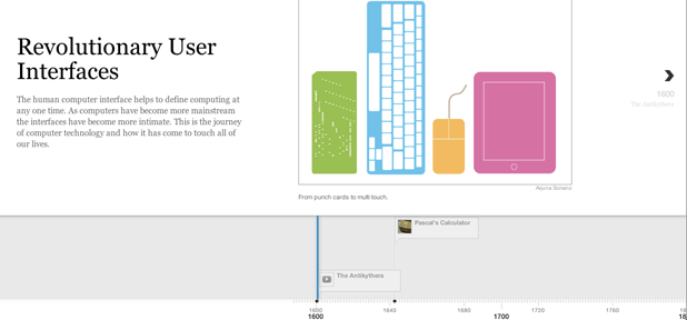
Timeline is an open source project that allows you to create a HTML5/jQuery timeline from a set of data. It is powerful enough to accept JSON as a data source, but it also works straight off a google docs spreadsheet. Play around with the included templates, and you get a clean looking slide show with a time control beneath.
Check out the user interface timeline.
It appears to work well with twitter, youtube, flickr and a few others. I’m planning on playing around with this as a way of communicating some of the qualitative data I’ve collected over the last year or so. It’s a shame there’s no interface (beyond a google spreadsheet) for building your own timeline; I imagine this to be a very powerful story-telling tool if provided to the right people, and with easy access to the media objects they care about. Of course, some kind of location integration would be nice too.
As a side note: I find it really interesting that even something that’s been traditionally technically inclined – like an open source project – uses phrases like “beautifully crafted” and “intuitive to use”. Does it represents a shift of focus towards user experience and design, or is it just a healthy dose of Apple-isms?
Paper Giant
At the start of the year,Reuben and I decided to finally start working on some ideas we’ve had for a number of years. We’re both working on PhDs that overlap in strange and mysterious ways, and we think we know a bit about solving those particular problems now.
So, we started a company. We’re working on our first OSX application that aims to solve some of the problems we’ve come across in our research, and somehow, amongst all the phd writing, we’re making steady progress.
If you’d like to be kept up to date, check out our website or follow our twitter account (@pprgiant).
Head down
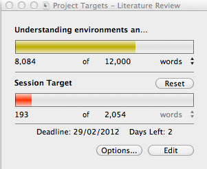
This is a quick post to break the drought here, and to let the world know that I have been working. The above picture is from Scrivener – my writing program of choice – showing the word target for my literature review. Writing this has been enjoyable so far (sort of), and has caused me to rethink and rework much of the approach I’m taking to the thesis overall. I’ve been doing lots of reading on human geography, and that topic will take up much of the remaining 4000 words.
The general gist of the literature review: Spatial concerns like distance, time and “place” (the social interpretation of a location) have been seen as things to overcome and solve through technology. But what if (like in human geography), we saw them not as something to solve, but as things to embrace? How does that change the way we approach new technologies?
Also, I find it pretty amusing that a 12,000 word document no longer scares me.
Search
Geoplaced
This is a notebook exploring the gaps between geography, sociology, technology, science fiction and things between.
I used to write about my PhD here, which I finished in July 2013. You can download a PDF or order a print-on-demand copy of my PhD thesis.
Themes
- art (1)
- Augmented Reality (2)
- Brain Dump (17)
- Conducting a PhD (13)
- Context (6)
- essay-a-fortnight (2)
- fiction (1)
- Government (1)
- How to: Get a PhD (5)
- inspiration (4)
- Knowledge (15)
- Location (19)
- Methods (6)
- Mobile (2)
- Parks Vic (17)
- Place/Space (5)
- Research Questions (11)
- Technology (3)
- travel (1)
- ubicomp (7)
- Uncategorized (11)
- Visualisation (10)

